Selected Works Key Takeaways ↓
Apple InfoSec · Staff Product Designer

The security metrics platform that told executives how much to trust each number

Apple InfoSec ran on a small BI team that hand-built metrics for every partner team. Coverage sat under 30%. Getting one new metric published took about two months. By the time a metric went live, it was often stale.

That left senior executives without a quantitative answer to the one question that mattered: how well are we keeping Apple safe? In board-level conversations they were using thumbs-up and thumbs-down emojis.

I replaced the static reporting site with a governed self-service intelligence platform. Every metric on it carries a visible trust level.

Role Staff Product Designer Strategy, interaction model, governance design.
Collaborating Teams InfoSec BI & Data Eng Incident management, 30+ partner security orgs.
Confidentiality Note Illustrative Data All numbers and screens shown here are reconstructed. No confidential Apple data is included.
BEFORE (2024) 28% COVERAGE
Internal Security Wiki Table

Static HTML tables updated manually via spreadsheets. No data lineage, stale quarterly reviews, and subjective status indicators.

MTTD Endpoint: 👍 Nominal
Cloud IAM Drift: 👎 At Risk
Audit SLA: Stale (Q2)
Subjective emoji reporting • No lineage
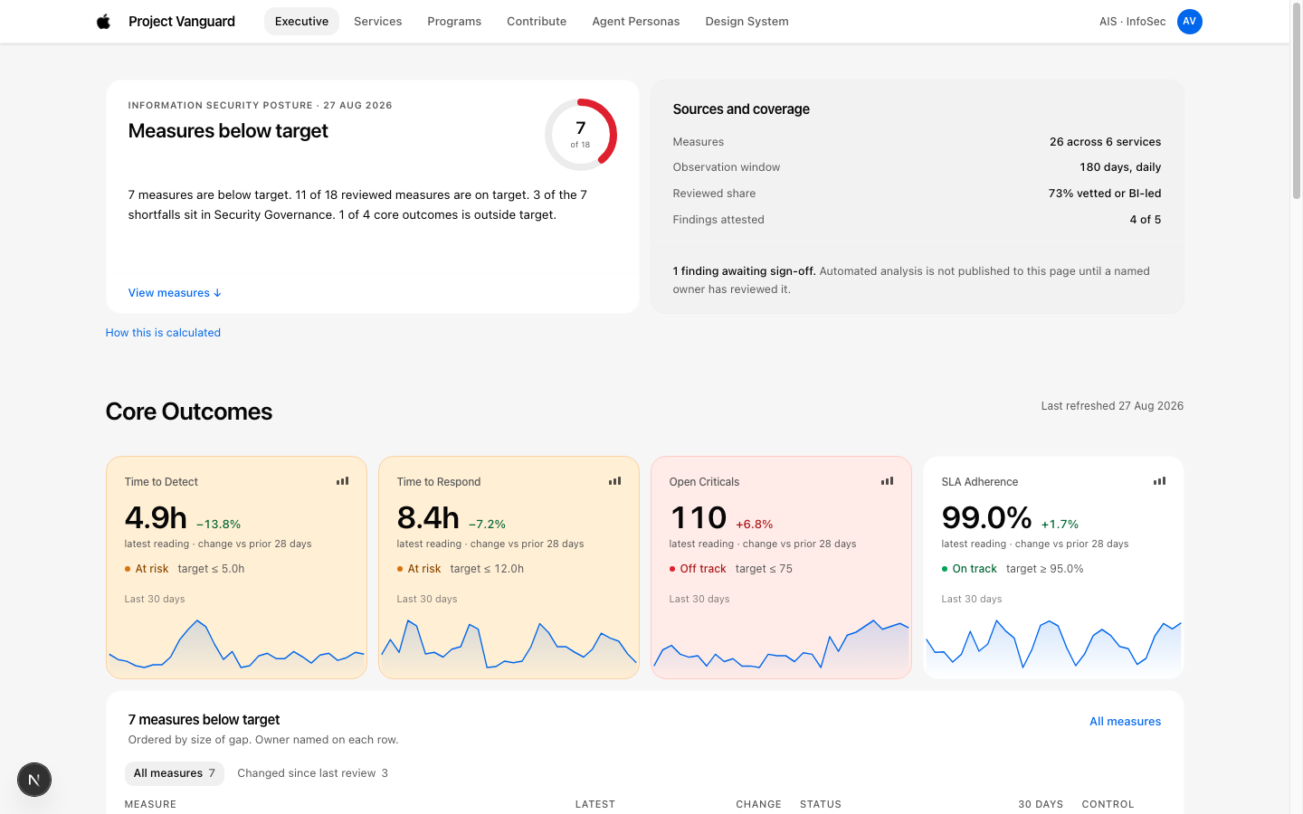
Project Vanguard Platform Overview
SHIPPED PLATFORM // 85%+ COVERAGE
Caption: Before and after. The change people notice first is the badge on every metric.
The problem

Executives had no defensible way to answer "are we safe?"

The BI team was the only path to a published metric. A request moved through four steps. Define the measure. Negotiate the formula. Chase data engineering. Publish. Average time was two months.

Because the queue was slow, teams stopped waiting. They built their own dashboards. Those dashboards held real metrics that never entered the central platform. So executives now had two problems instead of one. The central view was incomplete, and the numbers they heard in meetings did not match the numbers on the platform.

When a metric spiked, an executive had no way to check it themselves. They picked up the phone. That started a chain of formal and informal assurance calls across teams, repeated for every stakeholder who asked.

LEGACY WORKFLOW & SHADOW DASHBOARD FRAGMENTATION BOTTLENECK: ~2 MONTHS
STEP 01
Define Measure
Partner org drafts requirement
STEP 02 (CHOKEPOINT)
Negotiate Formula
Multi-week committee debates
STEP 03
Chase Data Eng
Pipeline backlog prioritization
STEP 04
Publish Central
Stale on arrival (Day ~60)
↳ Teams Peel Off: Proliferation of Shadow Dashboards

Unvetted spreadsheets, rogue Grafana instances, and conflicting numbers in leadership meetings.

CONFIDENCE = 0
Caption: Slow onboarding did not just delay metrics. It pushed teams to build in the dark.
Research

I went to the people who author metrics and the people who read them

I started with a design sprint with the BI team to map how a metric actually gets made. Then I ran interviews on both ends of the pipe. Six metric authors from partner security orgs. Two executives who consume the output.

The authors told me the bottleneck was negotiation, not effort. They knew their own data. They were waiting on someone else to agree on a formula.

The executives told me something I did not expect. Their problem was not missing data. It was not knowing which numbers were solid. They had learned to discount anything they could not trace.

DESIGN SPRINT MAPPING // BI TEAM

Process Bottleneck Analysis

Mapping the 5-conversation handoff cycle revealed that 70% of BI engineering time was spent mediating disputes rather than instrumenting feeds.

6 Metric Authors Partner orgs (Cloud, Identity, Endpoint)
2 Senior Executives C-suite & VP of InfoSec Assurance
AUTHOR PAIN: SPEED & AUTONOMY
"We know our telemetry cold. The bottleneck isn't getting the logs—it's waiting two months for a central team to approve our denominator."
EXECUTIVE PAIN: TRUST & TRACEABILITY
"Our problem isn't that numbers are missing. It's that we have no idea which numbers are rock solid, so we discount everything we can't trace back to source."
Caption: Two groups, two different problems. Speed for authors. Confidence for executives.
Strategy

The team had two plans. I argued for one.

When I joined, the team had already split the work into two separate tracks. Track one was to standardize and speed up metric onboarding. Track two was to build a security impact framework that answered the executive question directly.

I argued for a single solution: self-service.

My reasoning was simple. If each team can onboard its own metrics, then each team's own clarity and speed decides its coverage. The BI queue stops being the limit. And once a team has that autonomy, it has no reason to spin up a shadow dashboard.

There was a second win. A self-service platform generates its own usage data. That gave the BI team quantitative evidence to show their own leadership, who were also their customers.

I got buy-in by showing that track two was a reporting layer on top of track one. It could not exist without coverage, and coverage could not exist without speed.

ORIGINAL 2-TRACK PROPOSAL
Track 01: Central Onboarding Speed Optimize the internal BI queue
VS (COMPETING FOR ENG TIME)
Track 02: Security Impact Model Separate executive reporting layer
SHIPPED ARCHITECTURE

Single Self-Service Platform

01 Coverage: Speed in hands of authors
02 Shadow Dashboards Eliminated
03 Auto-Generated Usage Telemetry
Caption: One solution fed all three goals. Two solutions would have competed for the same engineering time.
The hard problem

Self-service creates a new risk, and the risk is trust

The moment anyone can publish a metric, every metric stops being equal. A metric vetted by the BI team and a metric published by a partner team on a Friday afternoon would sit on the same page, in the same card, at the same size.

So the executive question changed. It moved from "where is the number?" to "how much can I trust this number?"

That became my core design problem. Make the trust level visible on every metric, at every level of the interface.

SECOPS-INCIDENT-01 VETTED

Mean Time to Detect (MTTD)

● FRESH Synced 4h ago
Current Window
4.9 Hours
↓ -18% vs Baseline
Target: < 6.0h
Control Limits: 3.1h – 6.1h
Owner: SecOps Incident Response (J. Appleseed)
Lineage: 5 Verified Hops →
① Trust Badge Clear provenance before clicking
② Freshness Stamp Prevents stale quarterly reads
③ Accountable Owner Eliminates cold call chains
④ Lineage Link Inspectable audit proof
Caption: The trust signals live on the card itself, before anyone clicks into detail.
Design pillar one

Badges and lineage, so every number carries its own provenance

I designed a badge system attached to every metric. My first version had three badges: Self serviced, BI vetted, and BI led.

That version failed in review. "BI vetted" and "BI led" read as the same thing. Executives could not tell them apart, and a badge that needs explaining is a badge that does not work. I cut it down. "BI vetted" became "Vetted". "BI led" was removed entirely. Two states, clearly different.

Alongside the badge, I surfaced data lineage for every metric. An executive can open any number and see where it came from, who owns it, and how fresh it is. That turns a discount decision into an informed decision.

The badge never relies on color alone. Each state carries a distinct label and shape, so it holds up for color-blind readers and in printed board decks.

SHIPPED BADGE SPECIFICATION 2 DISTINCT STATES
● VETTED Solid square badge

Rule: Peer-reviewed by BI governance council. Full 5-stage automated lineage verified. Permitted in board summaries.

○ SELF-SERVICED Outlined pill badge

Rule: Published autonomously by owning team. Passed in-flow authoring gates. Visible with full context on service page.

REJECTED V1 (CROSSED OUT)
○ SELF-SERVICED
● BI VETTED
◆ BI LED

"BI vetted" vs "BI led" created confusion in executive testing. If you have to explain the badge, it failed.

Caption: Two badges survived. The third one lost because nobody could explain the difference out loud.
Design pillar two

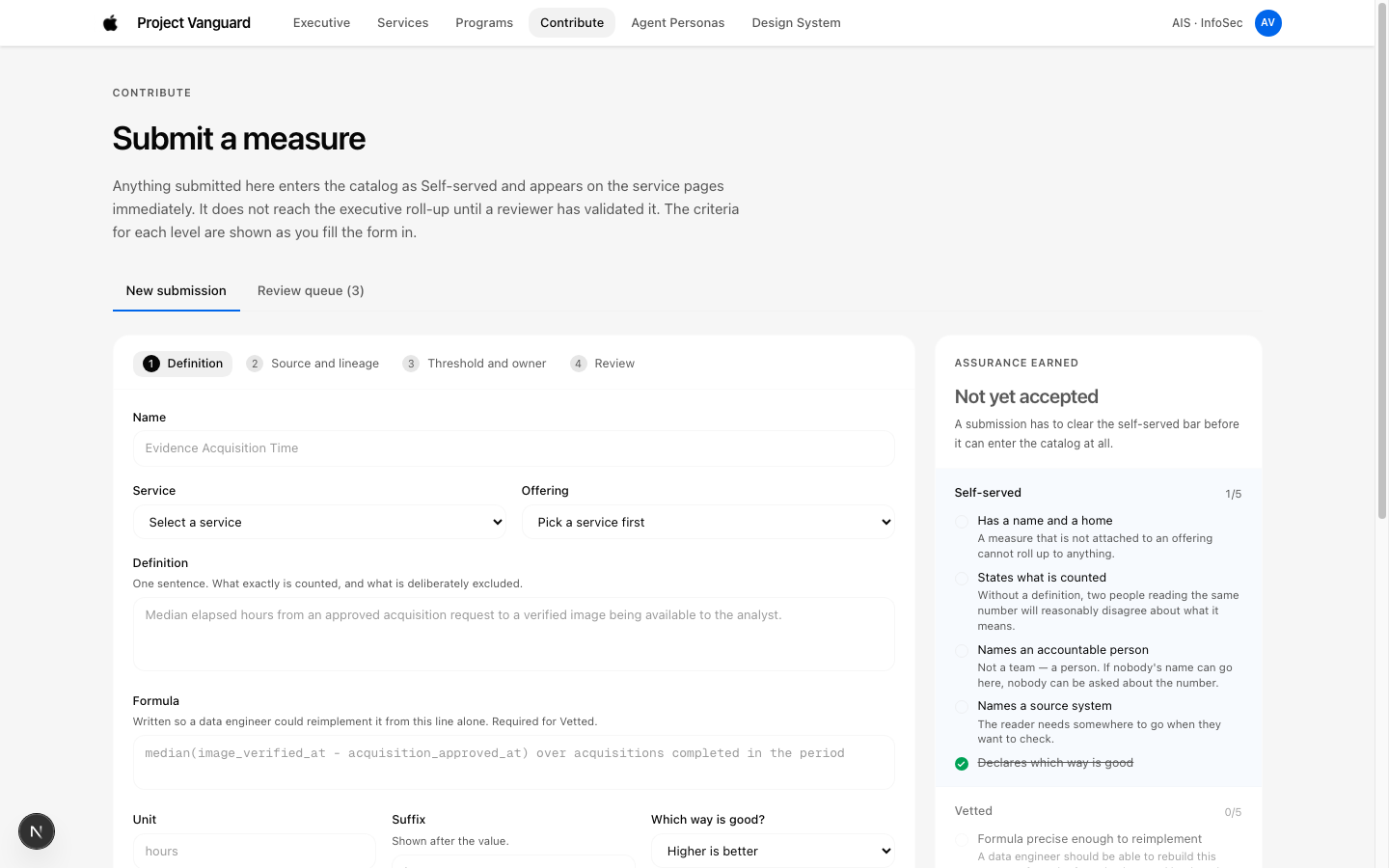
I moved quality gates into the authoring path

The original process reviewed quality after an onboarding request was submitted. That meant the BI team spent its time sending work back.

I put the quality gates inside the authoring flow. An author cannot advance until the metric has a clear definition, a stated formula, a named owner, a declared source, and a freshness expectation.

The result is that a badly formed metric never reaches the catalog. The gate does the rejecting, and the BI team stops being the bottleneck for basic hygiene.

The trade-off is real. Authoring takes more effort up front. I accepted that because the alternative was cleanup work spread across the whole team, forever.

OLD: POST-SUBMISSION REVIEW
Author drafts loosely → Submits queue
↳ 6 Weeks Later: BI reviews & rejects
Result: Infinite back-and-forth email churn
NEW: IN-FLOW QUALITY GATES
Gate 1: Definition & Schema Validation
Gate 2: Lineage Source Declaration
Gate 3: Freshness SLA & Owner Binding
↳ Direct Catalog Publication
Vanguard Authoring Flow and Quality Gates
Caption: The gate sits where the work happens. Review after the fact was costing the BI team its week.
Design pillar three

AI-assisted anomaly detection, with the human review kept visible

The second big cost was what happened when a metric spiked. An executive saw a jump, called the owning team, got a verbal explanation, then repeated that explanation to other stakeholders. Every spike triggered a chain of escalation calls.

I designed an AI-assisted anomaly detection and analysis flow to absorb that work. The system detects the anomaly, drafts an explanation, and routes it to a human reviewer on the owning team. The reviewer edits or rejects it before it publishes.

The design rule I held to was transparency. The executive sees the draft, the reviewer, the edits, and the final note. The iterations stay visible. A conclusion that arrives without its working is a conclusion nobody can defend in a board meeting.

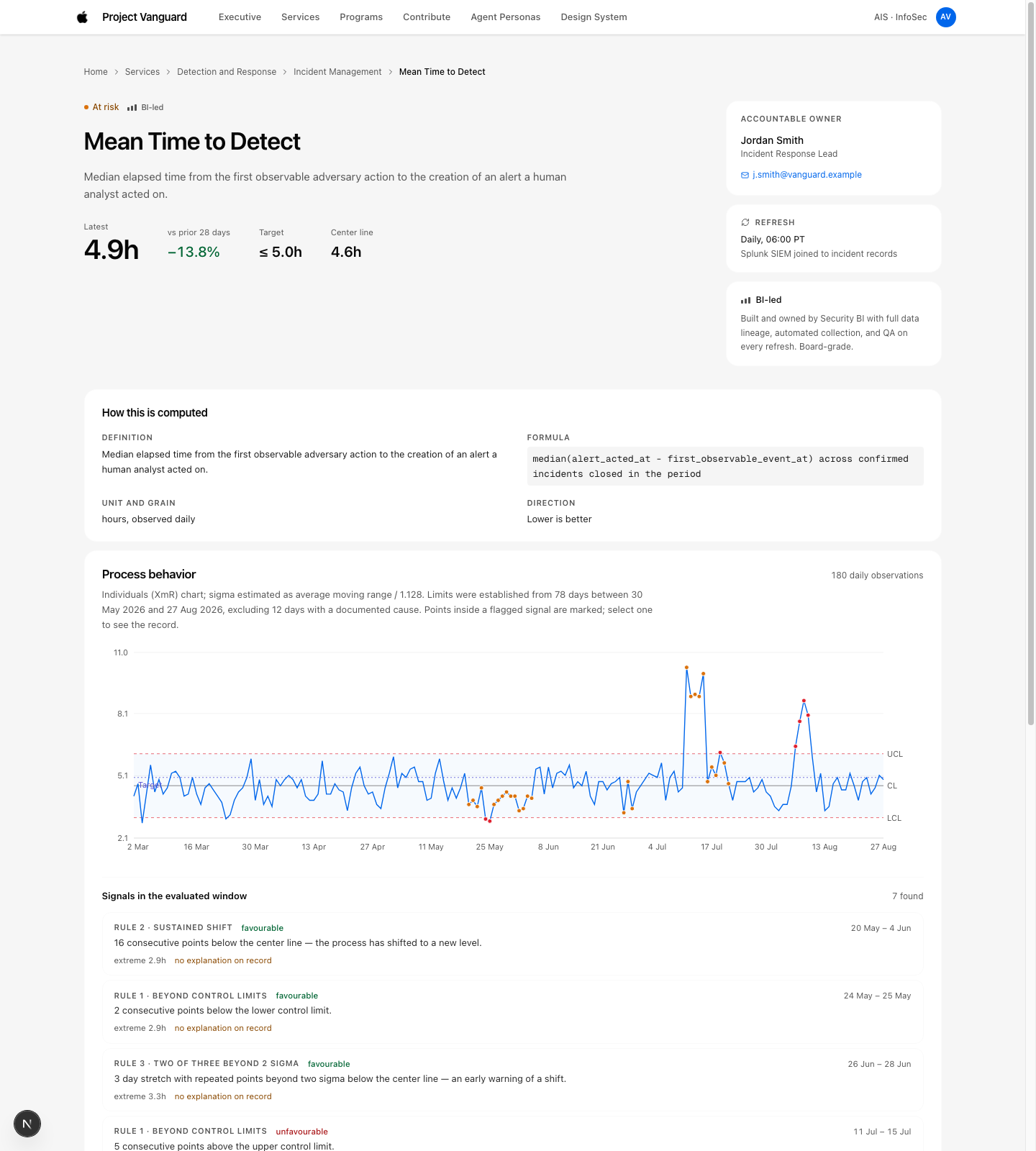
I also chose a standardized detail view built on statistical process control. That gives every metric the same read for what counts as normal variation.

The trade-off: a new metric has no history, so it cannot produce meaningful control limits yet. We accepted a warm-up period where the detail view says so plainly instead of showing limits it cannot support.

01 DETECT SPC Control Limit Spike
02 SYNTHESIZE AI Drafts Root Cause
03 REVIEW Human Reviewer Edits/Signs
04 PUBLISH Visible Audit Trail
Vanguard SPC Chart and Lineage Detail View
Caption: The human checkpoint is in the flow, and the edit trail is in the executive view.
Design system

I built an AI-ready design system so the whole team could move at the same speed

Design execution speed was its own problem. I solve that by building the system the work runs on.

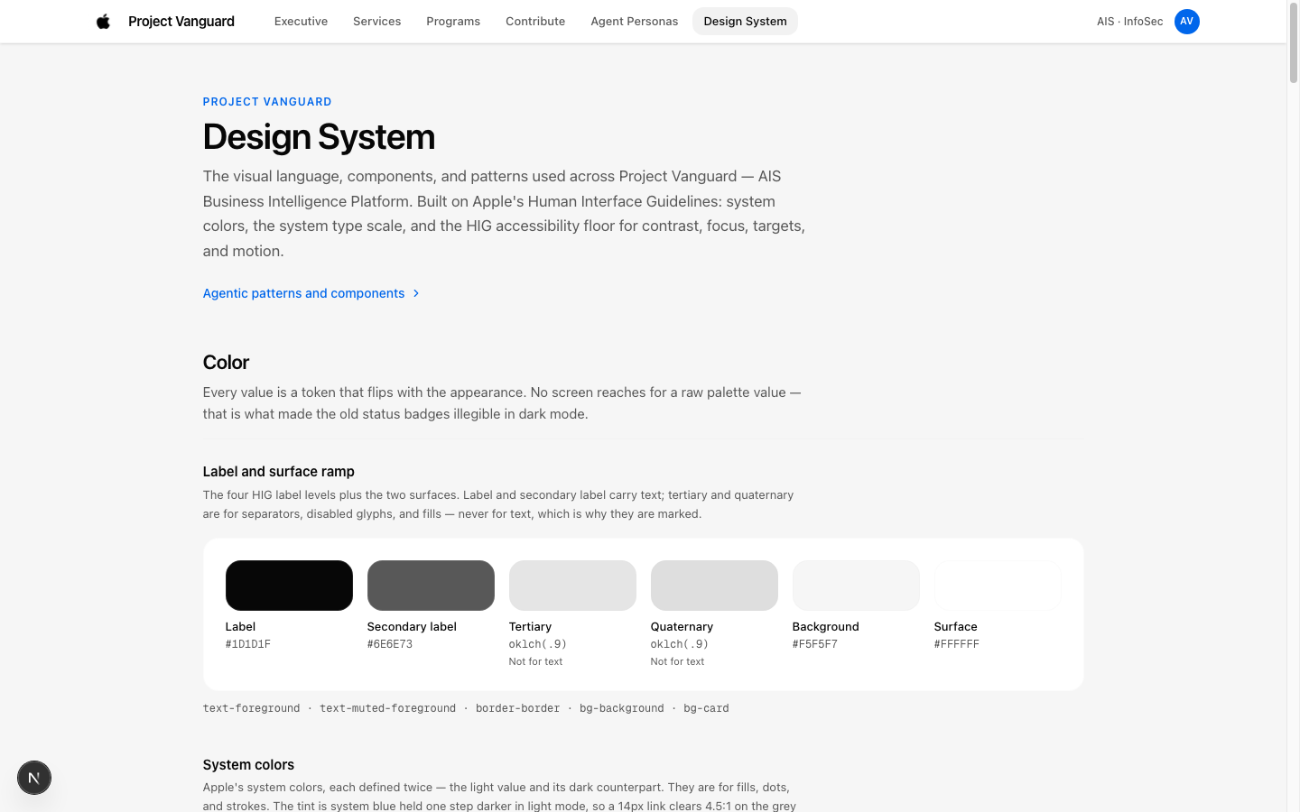
I authored an AI-ready markdown specification of Apple's Human Interface Guidelines. Then I authored a second one for shadcn/ui, the framework the team was already using. Both files are written so an AI tool can read them and produce on-system output on the first pass.

On top of those two files, I built the design system for the platform.

It did three jobs at once. It let me ideate and iterate fast. It let non-designers on the team produce work that stayed on-system. And it gave developers an exact token taxonomy at handoff, so the spec and the build spoke the same language.

# apple-hig-spec.md

Token taxonomy, typographic scales, and accessibility contrast rules formatted for LLM context windows.

# shadcn-ui-spec.md

Component primitives, Radix UI bindings, and TailwindCSS utility mapping.

Vanguard Design System Showcase
Caption: Two markdown files, one token set. Designers, non-designers, and AI tools all draw from the same source.
Outcomes

Coverage tripled, onboarding went from months to days

Metric coverage moved from under 30% to over 85%.

Average onboarding time dropped from two months to under one week.

Escalation calls during incidents dropped by roughly 75%. That figure comes from the teams themselves, reported in conversations after a one-month pilot with eight teams. It is team-reported, not instrumented, and I present it that way.

The change that mattered most is harder to put a number on. Executives stopped reacting to metrics with emojis and started asking about lineage and badge state.

METRIC COVERAGE
> 85%
Tripled from < 30%

Autonomous onboarding eliminated central queue dependency across 30+ service areas.

ONBOARDING VELOCITY
< 1 Week
Down from 2 Months

In-flow quality gates replaced multi-week back-and-forth formula negotiation.

INCIDENT ESCALATIONS
~75% ↓*
Fewer Ad-Hoc Calls

Visible lineage and signed AI anomaly notes gave executives immediate clarity.

* Figure is team-reported from qualitative stakeholder interviews following a 1-month pilot with 8 security orgs.
Caption: Three numbers. One of them is self-reported, and the case study says so.
What I got wrong

The first version hid self-service metrics, and that was the wrong call

My first design hid all self-service metrics from the executive view. The logic seemed sound at the time. Protect executives from unvetted data.

It failed. Hiding the metrics recreated the original problem. Executives were back to an incomplete picture, and the teams whose metrics were hidden had no reason to use the platform.

I reversed it. Every metric now appears with equal visual weight, and the badge carries the difference. Let people see everything, and tell them plainly how much each thing is worth.

One problem is still open. When the AI drafts are usually correct, the human review turns into a click. A high approval rate is not evidence that oversight happened. I do not have a clean answer for this yet. My current thinking is to measure review time and edit rate instead of approval rate, and to sample drafts for blind re-review. That work sits with the team now.

V1 REJECTED: HIDING UNVETTED METRICS
● VETTED METRICS: VISIBLE
[SELF-SERVICED METRICS: HIDDEN FROM EXECUTIVE VIEW]

Failure mode: Created blind spots. Executives assumed missing numbers meant safety, while teams abandoned the platform.

V2 SHIPPED: EQUAL VISUAL WEIGHT + BADGE
INCIDENT MTTD ● VETTED
POLICY BACKLOG ○ SELF-SERVICED

Success: Complete visibility across the entire threat surface, with trust communicated explicitly on the card.

Caption: Hiding the weak metrics brought back the problem I was hired to solve.
Closing

What this project was really about

I did not design a dashboard. I designed the rules that let a whole organization publish its own metrics without losing the ability to trust them.

The three pieces that made it work are portable. Make trust a visible property of the data. Put quality checks in the authoring path, ahead of the review. Keep the human checkpoint visible when AI does part of the thinking.

Those three apply to any system where AI produces output and a person has to stand behind it.

THREE TRANSFERABLE PRINCIPLES & IMPLEMENTATIONS
PRINCIPLE 01 Make trust a visible property

Data without provenance gets discounted. Attach assurance tiers and lineage directly to the primary surface.

Feature: Trust Tier Badges & 5-Hop Lineage
PRINCIPLE 02 Gates in the authoring path

Post-submission review burdens central teams. Enforce validation at entry so bad data cannot enter the catalog.

Feature: In-Flow Form Validation Gates
PRINCIPLE 03 Human checkpoint kept visible

AI drafts must not be opaque. Preserve the draft, the human editor's diff, and the signature in the executive read.

Feature: Anomaly Synthesis Audit Trail
Caption: Three principles, pulled out of the project so they can travel to the next one.